I read somewhere that it can be helpful to take a step back and just look at your work. Not from an artistic perspective or a storytelling or an editing one, but from a visual one. The idea is that, if every page looks the same (whether it’s big blocks of text or lots of lines of dialogue), you may need to switch up your storytelling style a bit. It’s just another subtle way of keeping your readers’ attention, I guess.
So, on a recent revision of my manuscript, that’s what I did. I took a step back, and looked at the first page and a half of a chapter.
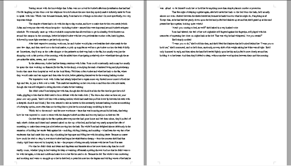
I have to point out, here, that the reason I did this was because I was leery about starting another chapter with a lot of textual explanation, as I’d done the last chapter. Anyway, here’s what the initial draft looked like:
Whoa. What a wall of text. It’s necessary text, though. There’s a fair amount of explanation that happens, to set up the minor conflict of this chapter. But there’s already a lot of description and setup that happens in the surrounding chapters, and I didn’t want to subject the reader to having to read these huge intros every time.
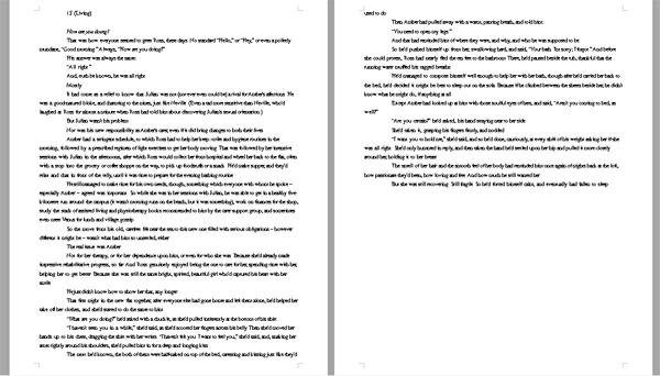
So, here’s the second draft:
All I did differently was break up the blocks of description and explanation with some more personal insight from my main character, answering questions from other people. The same information is offered, but it’s broken up into what I consider more manageable pieces.
And, doesn’t it look a little nicer to read, too?
I’m not afraid to read lush description, but sometimes you just need to change it up, for sake of your reader’s eyes. What about you? Would that wall of text have scared you off? Do you find it helpful to look at your stories in a visual way?


Interesting thanks i wouldn’t have thought of that!
Even while writing, I feel the need to change it. Even I get bored of my main style!
This is great. It actually reminds me of a workshop I took where the instructor said to look at the white space vs text to figure out where to make your graph breaks. When you compare books written today vs 50 years ago you can totally see the difference in white space. I think it really goes along with our dwindling attention spans, although I know that idea ruffles feathers on some people. So, I think you were savvy to break it up. Walls of text do turn today’s more modern readers off, which I think is sad.
You’re right, Kate.
I’m a big fan of those wordy 19th Century authors (the Victorians and Gothics were my specialization), and even I find some of those page-long paragraphs intimidating. 🙂 I find it sad, too, that some people are advocating writers to change their styles to be choppier, to suit today’s attention spans. Telling me to change the way I write is like telling me to change the way I walk! But I do see the importance of varying techniques, especially when it comes to white space on the page.
Thanks! 🙂
Thanks, Gilly! I learn so much from other blogs – like yours – that I’m happy when I can help spread some writerly love. 🙂
I like my style, for the most part, though I’m naturally very verbose. 😀 Editing is where I really like to tighten things up, if it’s warranted.