by Mayumi-H | Sep 10, 2016 | Fearless, Finding Mister Wright, From Hell (A Love Story), Uncategorized
Earlier this week, I updated the main header image on this blog. The last image was a photo I’d taken a few years ago in La Jolla, and its setting sun scene was pretty, but, over time, I came to associate it too much with decline. Decline of readers, decline of interaction, decline of my self.
A header image is rather like a book cover. It should say something about the writer, and that “declining” feeling of the old header image wasn’t what I wanted to project as indicative of me or my work. So, I went through my drawing archives and picked out a bunch of pictures that represent me and the stories – or attempts at stories – I’ve made over the years. Long-time readers may recognize one or more of the characters and stories on display, but, from current left to right, they are:
- My adulterer/lovers, from many 100 Word Challenges for Grown-Ups and Five Sentence Fiction entries
- Amber, from Fearless
- Chie and Yousuke, from 1 More Chance!
- Nev, from Fearless
- Fram, who is the only one not from a story, but whose helmet I spent too long researching and drawing not to include here
- Sally, from “Slave Girls and Shining Knights”
- Ross, from Fearless
and
- Zera, from “Anywhere but Here”
These selections may change over time, as I hope to develop my drawing skills along with my writing, because I really want to get some representation for my Borderlands From Hell (A Love Story) continuity up there. Someone or someones from my “Finding Mister Wright” stories needs to be up there, too, because even as I write this post, I’m finishing up yet another tale of love, growth, and honesty with the Wrights and McAllisters. But, for right now, this is what I’ve got.
This is me.
by Mayumi-H | Jan 7, 2013 | Excerpts, Fearless
(Or, visualisation, if it please you, Beth. ;))
I think writers should be as visual as traditional artists. Perhaps more so, because we need to provide description for a reader, without the benefit of a comic panel or moving image. But, dwelling on description overlong can become tedious for a reader, and that we never want.
“Good morning,” he replied, coming to a slow stop in front of her. He propped his board beside him, shielding her from the bright sun; it didn’t make her any less pretty.
“Ah…Amber, yeah?” he said, feigning blase non-involvement.
She nodded. “And you’re…” She paused a moment. “Fearless?”
He snorted. “Close enough. Ross.”
“Right,” she said. Though from her smile, he guessed she hadn’t needed the reminder, either.
He raised his brow at her. “You need help with something?”
“You said I should stop by,” she reminded him, as she glanced up at the sign of the shop, with its graffiti-style lettering. Looking back to him, she smiled again. “So, here I am.”
“Here you are,” he echoed, as he felt himself break into a smile, too.
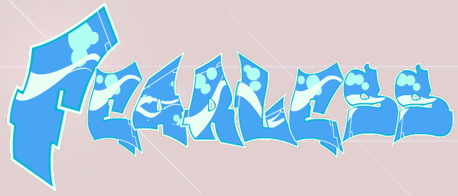
That’s the only time the shop sign is mentioned, but I still came up with a design:

The Fearless shop logo
Mostly, I did it because I like playing around with graffiti. But, I also think it’s important for a writer to have a firm vision of the world in which their characters live. The more we know – either in our heads or on the page – the less we need to explain to the reader: the details usually invariably find their way into the story on their own.
I design (or, at least, I keep detailed notes for) every location of any import in my stories, from Ross’s living loft above the shop, to Amber’s hospital room, to the Truro flat. I did the same for a Japanese apaato and a country ryokan, a starfaring tramp tanker and a soldier’s little love nest. Because understanding where your characters are will help everyone understand where they go, how, and why (we call that “blocking” in theatre-speak).
How do you design your locations in your stories?


Recent Comments